Scott Sanker_designer
UX Manager | Project Owner | Product Manager | Supervisory Manager
BACK TO PORTFOLIO
BACK TO DOWNLOADS
UI DESIGN_iPlan
iPlan Interactive Room Diagrams
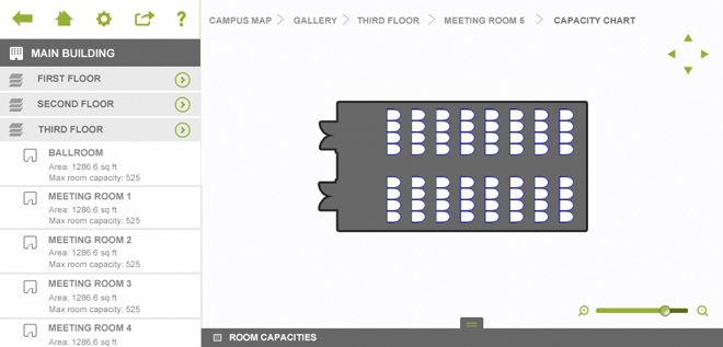
iPlan is a way for meeting and event planners to market and sell event space online. It’s a virtual tour that a venue's sales team can use onsite or remotely to engage and close event business. It’s also an online interactive experience that event planners use to discover venue’s capabilities.
My task was to redesign iPlan to accomodate its new features and function in a multi-platform environment using html and jQuery styling. An emphasis was put on the mobile user environment while still maintaining desktop functionality.
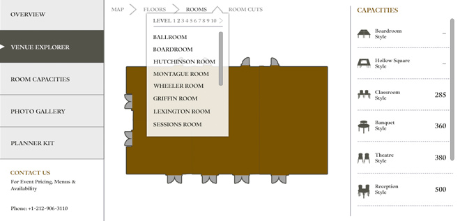
iPlan_Hotel Venue Explorer
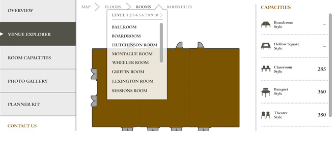
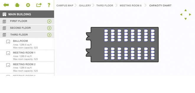
This is one of the main portions of iPlan which contains the bulk of the content and interaction. Functionality, navigation and customization were just a few of the challenges that shaped the overall feel of the application.
iPlan_Customer Website
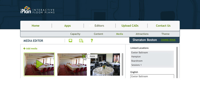
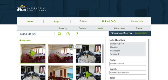
My designs were used for the customer facing site as well as the individual editor and application preview screens that the users will utilize to customize and implement their new product.
DOWNLOAD COVER LETTER

- Karen Mathews
- Project:
- MeetingMatrix Online Development
- Company:
- Newmarket International, Inc.
His design work and mock ups and the results have always been pretty compelling and well thought out. Now that I'm more involved in the design aspect, I feel much more comfortable knowing I have a resource at hand who's ready and willing to take on whatever I throw at him.
GRAPHIC DESIGN_Logo design
Stone Creek Technology
This logo was created for a technology company looking to improve their image with their customer base. The brief called for a clean, proffesional and memorable logo that was appropriate for their market. Strong hues were used to give the client a solid feeling that promotes this companies established excellence.
Affinity Consulting Group
The finished product(large "A" logo) is one that reflects the joining of business and technology. The bold feel that was given to this logo also reflects the clients established place in the technology market.
Smart Mobile Group
This colorful mobile technology company logo was created based on the client's trailblazing concept of doing business. Smart Mobile Group is a one stop shop for mobile app development and support and is providing all the tools to create and maintain a successful mobile application in one spot. The composition uses bright colors and playful forms to communicate SMG's poineering energy.
Portsmouth First Night
Portsmouth, New Hampshire is one of the oldest cities in our country and is also one of the most culturally rich. When designing the Portsmouth First Night logo I drew upon its historical surroundings and stimulating atmosphere to capture why it is such a great place to spend the new year.
Pirate Water Sports
An old logo requiring new life. The brief was to enhance the Pirate Water Sports brand to reflect their rapid growth and entrance into the performance paddle board market.

- Dave Bundy
- Recommendation:
- Associate Creative Director
- Company:
- MeetingMatrix International
Scott has a great combination of skills that make him a must-have for any organization. Not only is he a talented and creative artist, he is also skilled at learning and managing technical processes. Scott also has natural leadership and work culture skills that are a must-have in today's business environment. I would recommend Scott to any organization.
CONNECT ON LINKEDIN
INDUSTRIAL DESIGN_Product Design
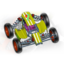
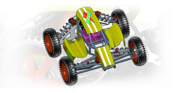
PRODUCT DESIGN_Dune Buggy
This all-terrain vehicle was produced for a client that wanted a new version of this type of vehicle that would exceed current performance standards. It was created using 3D rendering software so that its structure could be manipulated on the fly and viewed at multiple angles.
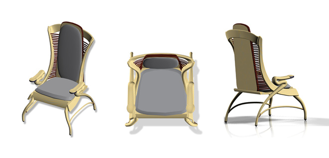
PRODUCT DESIGN_The Mélange
The occasional chair is a piece of furniture that is used on occasion(as its name implies). Its often simple appearance and exposed supports are meant to serve as an accent to primary furniture sets that are used regularly.
The Mélange was born as a result of the client's request to put a modern spin on an old idea. Although most of its structure is still exposed, it has been given a few upgrades from traditional occasional chairs that allow it to not only blend with the rest of your furniture but also stand out on its own.
It is composed of a variety of materials. The framing and support elements are made from acacia wood. Smokey leather cushions, rattan wicker, mahogany trim and marble accents make up the rest of the Mélange making it a new classic.
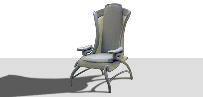
The chair was initially created using 3D rendering software and Photoshop. The design was then brought to life using a 3D printer. Well over a thousand layers containing powder and resin were used to produce a small scale version of the Mélange, bringing it from screen to reality.
DOWNLOAD SAMPLES

- Jeremy Short
- Project:
- collaboration software development
- Company:
- MeetingMatrix International
Scott acted the part of a business analyst, project architect, technical support, and creative design artist. He reached out for user feedback, and was more than willing to provide support after launching. He embraced the challenge of expanding his understanding of software design and proved he is fully capable to act in every role.
DOWNLOAD RESUME

- Don Basler
- Project:
- logo design and branding
- Company:
- Smart Mobile Group
With Scott, you get a partner who takes the time and energy to make sure your website reflects your business. He has been professional, a great collaborator, always accessible, and has that rare ability to transform business ideas and concepts into reality. I would highly recommend Scott to anyone and everyone looking for web/graphic design services.
UI DESIGN_Delphi
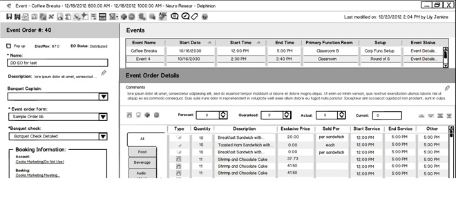
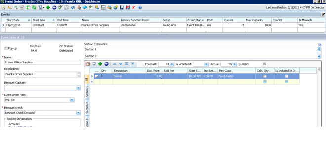
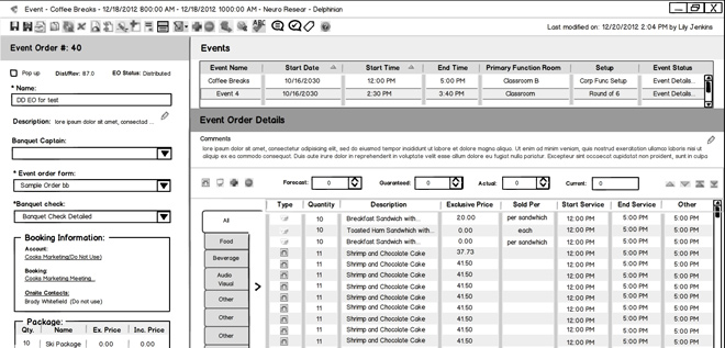
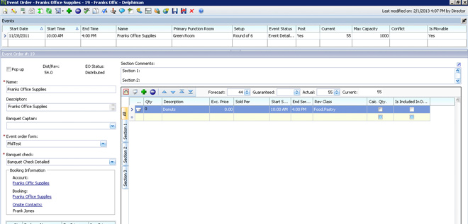
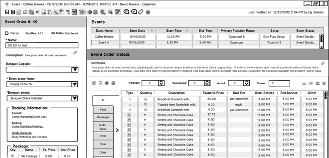
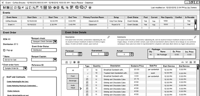
The mockups pictured above were a result of current user and product stakeholder feedback. The goal was to create an improved user experience by constructing an interface that established a distinction between each functional area, reinforced an efficient workflow and refined each element within the current functional limitations.
The scattered appearance of the original screen was given a clean restyle in which related fields were grouped and each element was scaled and aligned to reflect an orderly and consistent interface. Color-coded headers were introduced to help establish distinction between each area. The "Event Order #" is the first region the user interacts with and was put in the left and top most position because of this. "Event Order Details" is last to receive the user's focus, but is also the most used. To account for these behaviors, this region was assigned the bottom right position of the interface and was given the most real estate.
GRAPHIC DESIGN_Branding
At MeetingMatrix, I provided branding guidelines and ensured that internal and customer-facing materials met our brand and messaging standards.
MeetingMatrix was successful in its ability to convey its products and overall message through a unified voice. This was the result of the marriage of its brand and messaging. I was a key part of the brand's success by providing logos, color palettes, imagery and layout specifications that were aligned with the marketing strategy.
SKYPE ME
814_932_5204
INDUSTRIAL DESIGN_Product Design
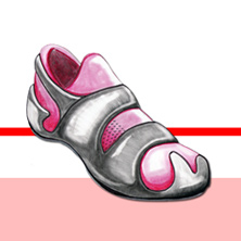
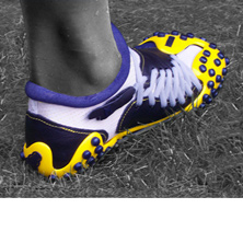
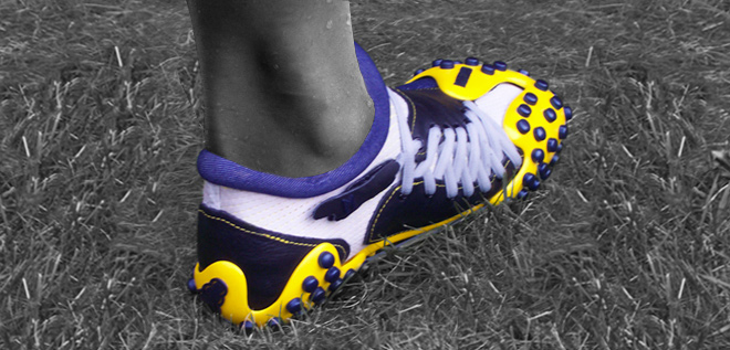
The Myriad trainer is the redesign of the shoe as we know it. A myriad literally means a countless or extremely great number. The name describes the possibilities of a shoe that has an interchangeable upper and sole portion. The two components are held together by a suction technology for a lasting bond and maximum comfort.
Design Objective
The purpose of the Myriad is to introduce footwear that could make it easier for individuals to participate in multiple sports and activities without having to buy another pair.
The idea is to create the first in a series of multi-sport products that look, feel and function as good as(or better than) their existing counterparts.
Design Criteria
The shoe must successfully enable the user to participate in multiple fitness activities while maintaining function and comfort needs.
In addition to its utilitarian aspects, the Myriad sets out to forge a more personal relationship between the athlete and their footwear by offering a limitless supply of customizable upper and sole combinations.
The Myriad's life cycle is completed with the use of recyclable materials to increase user gratification and provide another advantage over the average athletic shoe.
closeALTOONA, PA
VIEW NEXT
VIEW PREVIOUS
VIEW NEXT
VIEW PREVIOUS
